
When I’m nervous about doing something new, I try to learn as much as I can in advance. This usually involves reviewing websites and reviews that allow me to plan and strategize. I’m sure I’m not alone in this.
This is why it’s so important for food pantries to present clear information on their website. With such a strong stigma against receiving food assistance, pantries should assume that people are nervous about visiting, especially for the first time. One of the most effective things we can do to ease anxiety is to be explicit about what to expect at a visit.
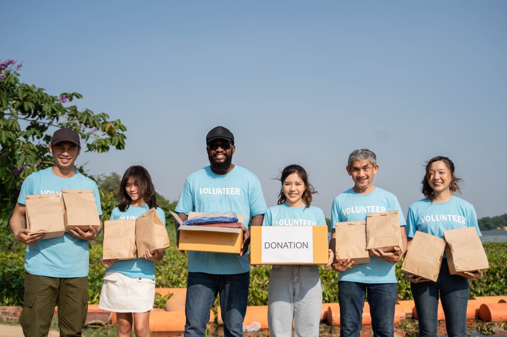
This seems straightforward, but if you review almost any food pantry website you’re likely to notice they tend to highlight volunteer shifts and pantry supply needs rather than user information. (If you have an example of a pantry website focused on shoppers, please comment!) For many pantries, there’s only a short bulletin about the shopping experience, with more information dedicated to the community supporting the organization like donors and volunteers.
This is not surprising, given that most pantries have focused their outreach on volunteers and donations since they established their internet presence. It’s hard to move away from this model because of chronic shortages of both volunteers and resources.

But we’re currently facing an increase in food pantry shoppers as economic stability ebbs and hunger rates rise. Many people may soon be contemplating visiting a food pantry for the first time. If they’re anything like me, they’ll spend some time looking up websites and trying to understand what the experience will look like before they take the plunge and actually visit a pantry. Like any business, a website that demonstrates dignity and respect will look far more attractive to potential shoppers than one that is dismissive or condescending.
This is why it’s so important that food pantries have outreach materials that prioritize people experiencing food insecurity. Done well, it won’t deter any donors or volunteers with a genuine interest in helping, and can improve the shopper experience. Done poorly, it’s easy to deter someone from ever even trying to visit and getting food.
Food Pantry Website checklist:
- Place visitor information front and center. If shopper information isn’t on the home page, have a large tab with a clear title (Need Food? Find Food, Visit our Pantry, etc.) that clearly directs people seeking services.

- Outline the shopping experience. Explain what information your pantry needs from visitors, including requirements like ID and documentation. Let them know if they need to wait in line or take a number, and if they get to shop the pantry like a grocery store or are limited choice.
- Share information about the food supply, like whether you can accommodate special diets or cooking capabilities, whether you carry perishable products, how often visitors can come, and how much food is available to each household. Include everything that is shared at a new client orientation in the pantry.
- Include an FAQ, with information about parking, whether they should bring their own shopping bags, if there are volunteers able to help carry items, or whether people are allowed to shop for others who can’t come to the panty themselves.
- Share your pantry schedule, including holiday closures or any adjustments to your operating hours. Whether or not someone eats dinner literally depends on them knowing your schedule.
- A statement about inclusivity helps people gauge whether they are welcome. For example, statements about welcoming LGBTQIA2S+, immigrants, or other marginalized communities help shoppers determine whether it’s safe for them to visit. Keep in mind that the absence of this language is an equally powerful statement about who your pantry supports and welcomes.

Focusing this information front and center can also enhance the attractiveness of your pantry for those volunteers and donors your hoping to bring in, by helping them get a clearer picture of how your organization operates. Focusing on the shopping experience won’t deter anyone genuinely interested in engaging with your pantry, and can help alleviate the nerves of individuals anxious about making their first visit receiving emergency food assistance.
The opinions expressed here are solely my own and do not express the views or opinions of my employer.
Want to learn more about food justice? Subscribe so you never miss a post!
